

JYK Photography
Designing a new site for an up and coming, local photographer

Overview
Role: Freelance UX Designer
Business: JYK Photography
Duration: 2 weeks
Tools: Figma, Canva, Whimsical
The Background
Janice is the sole photographer and business owner of JYK Photography. Taking photos started as a hobby at different events for her friends and family, but she has turned her photography into a business. She provides services to her close friends and family but is wanting to expand her clientele.
GOAL: to provide affordable and personable photography services through the website for JYK Photography.
The Challenge
To design a responsive website that allows users to learn about the photographer and contact her to book her services
Research- What Makes a Photography Website Good?
Research Objectives- What Goes into Hiring a Photographer
Determine what life events people want to be documented
Determine what factors help people hire photographers
Determine what factors prevent people from hiring photographers
Competitive Analysis- How Do Other Photography Websites Look?
Began research by searching online articles and yelp to find competitors. From there, I got a framework for standards, best practices, and what should be included in JYK Photography

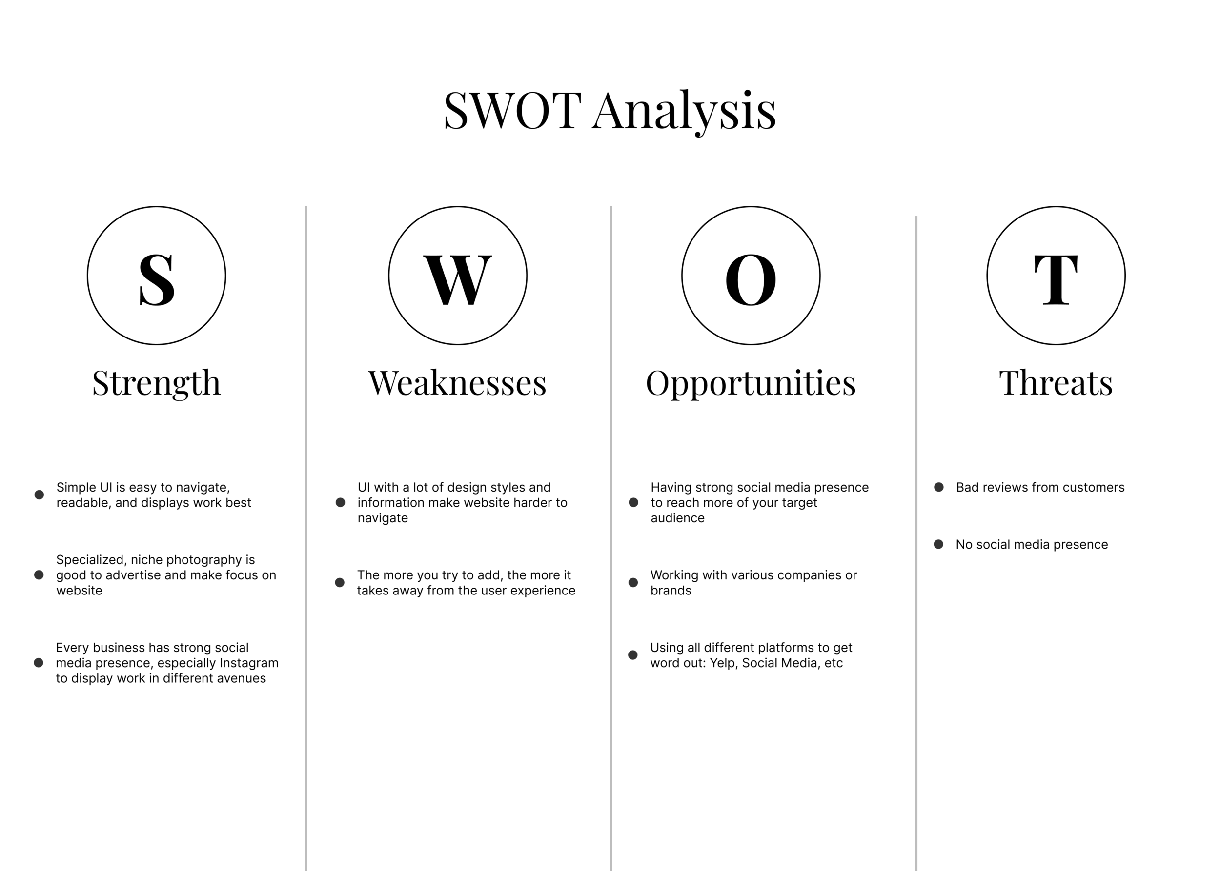
SWOT Analysis- After examinining and researching various sites, it became clear what strengths, weaknesses, opportunities, and threats a photography website could contain
Key Findings:
With websites that display photos and content, having a simple, clear UI goes a long way. When there were multiple styles, it was overwhelming to navigate the site. Specialized, niche photography is trending and a way to distinguish yourself as a photographer. Photographers could utilize social media as an opportunity to make themselves known
Interviews- What People Want in a Photographer
Conducted 1:1 interviews with 5 participants who were all females in various seasons of life

Key Findings from Interviews:
All participants listed price as the top thing in hiring a photographer, preferred the setting to be in nature, mentioned they go through recommendations from friends and check social media for the style of the photographer. They also expressed liking more direct photographers while having the choice to express their opinions
Define- What Will the Website Include?
I developed the user extensively in order to build the JYK Photography website with intentionality.
Meeting with Client- Kickoff!
Had an introduction meeting with the business owner of JYK Photography to start of work relationship.
It was a short, informal meeting where we went over what she expected and wanted, what her goals were for the website, what deliverables I would be providing, the timeline she could anticipate and any questions either of us had.
Empathy Map- 5 Interviews become 1

Personas- Who JYK Photography is Trying to Win Over
Wanting to highlight the trends emerging from my interviews, I created a persona, Cameron Johnson. The goal was to capture the fact that she wanted to find a photographer she could trust, collaborate with, and that fell within her budget.

Card Sorting- Does the Content Make Sense?
Conducted an open card sorting to determine if the website I had in mind would make sense to others. After asking 6 participants, I found that it was confusing and unintuitive, so I also conducted a closed card sorting to find out if the task of sorting itself was difficult or if the content was difficult to sort.
Open Card Sorting

Findings:
The most common pairings were: couples/family and booking details/FAQs/services/billings
Participants found it difficult to sort the cards into categories
Some cards seemed obvious to pair, but the rest were ambiguous and hard to sort
Closed Card Sorting

Findings:
Some participants said having the categories provided made it slightly easier for them
Participants finished a lot faster than the previous card sorting
Participants put 2 cards: Booking Details and Questions in a section I did not expect
The conclusion was that the task itself was difficult, but the closed card sorting did provide more clarity and insight to the user. Overall, it gave me the green light to keep the content as brainstormed.
Design- Time to Create the Website
After researching and defining, the work began on bringing the website to life!
Site Map- Organizing the Website in a Clear Way
The sitemap was created to visualize how the content would be laid out. I included what the business owner wanted, brought it what I saw necessary based on research, and organized it based on the feedback from cardsorting.

User Flows- Vision for How the User will Interact with the Website
With my persona, Cameron in mind, I created a user flow. For the user to get to the next step of booking the photographer, they would have to fill out the connect form so I made that the goal of the user flow.

Brainstorm- Looking at Other Sites for Best Practices
Looked online on various photography websites and blogs to finding local, highly-rated photographers.

Sketching- Taking What I Liked and Creating Vision for JYK Photography
Based on the brainstorming session, competitive analysis, feedback from the business owner, I sketched out potential frames of the photography website. I made most iterations for the home page since that would be the first thing people looked at.

Wireframes- Going With What Would Allow the Business to Stand Out
After sketching out various options, I decided to go with sketches that would highlight and compliment the photographer’s work. I received some feedback from a mentor who had photography background as well as the business owner.

Meeting #2 with Client- Learning to Balance User Needs vs. Business Needs
Met with business owner to go over progress, learnings, and research. I went through a slide deck and overall was impressed with the amount of research that was put in for her website. She also provided feedback on what she wanted for her home page.
Based on what she requested, I was conflicted with her needs vs. what I came to learn that the users wanted. After guidance from a design mentor, I conducted A/B Testing and spoke with the owner about it. We came to an agreement that my layout would work best for her business and continued on!

Results from A/B Testing:
4 out of 4 preferred the B wireframes.
Why some preferred B were because it reads more like a photography website, provides more images of their work, it was a more visually appealing website (less large chunks of text), and also more opportunities to showcase the “product” which is the photos taken.
Feedback on Wireframes- Time for iterations, versions, and 2.0s

UI- The Creative Part: Filling Out the Website
Talking with the client was crucial for this point because she had a specific color palette and feel in mind. She also already had a current logo that she wanted to use.
After our conversation, she sent over images of color palettes and styles of photographers she liked. I created a mood board and style tile that reflected what she envisioned.
Mood Board

Style Tile

Responsive Site- Bringing the Research, Ideas, and Input to Life
With the business owner being pleased with the style, I created a first draft of the design of the website! It was exciting as it was the first time we got to see her website come to life.


Feedback on Wireframes- Time for iterations, versions, and 3.0s
I received feedback from a mentor and fellow peers on critique sessions. It seemed like a daunting task because it felt like there were so many things that were off, but as I worked through each of the feedback provided, I began to feel more confident and comfortable with the direction of the design.
Notable, big-ticket item changes were:
Logo placed on top left, rather than middle.
Got rid of "Home" text navigation and replaced it with logo.
Tagline/Message on the "Above the fold" landing page to tell user what the business is about.
Changed layout of portfolio pages by getting rid of the overview and creating categories for the pictures rather than specific sessions.
Added new section- FAQ.
After completing the changes, I learned to value and appreciate the power of feedback and critique. I believe it enhanced the website, making it a more cohesive experience for the user.

Testing- Does Someone Actually Want to Book JYK?
Prototype- Mock Website to Test Users
I made a prototype with Figma which allowed my design to look like an actual website. I recruited 5 people for user testing where I gave them 2 tasks to complete and evaluate the layout of the website. From there, I made adjustments according to their pain points, successes, and feedback.
Take a look HERE to check out the prototype!

Affinity Map- Results Based on User Testing
After conducting user testing, I created an affinity map to help me prioritize the changes I should be make on the website design. Based on an “effort by organization” chart, I concluded what changes would be worth investing in.

Iteration- Taking the Feedback and Making it Better
After conducting user testing, the main changes that were made to the design were the following:
Changing the picture in the "About JYK Photography" section
A, B, C testing to determine a different font for the headers
Updating the footer to include contact info as well as social media links

Next Steps
Present final product/deliverable to the business owner and determine if she would like to include pricing or still intentionally keep it off her website.
Learnings:
Feedback helps! Because I had become so invested in my design, I was blind to other problems. With other sets of eyes looking, they brought up important issues. Making those changes helped the website become more clear.
Bring it all back to the research! A lot of research was done in order to figure out how the website should look, so it’s important to make informed decisions and show that informed decisions were made.