

Kaus Insurance

Overview
Role: Product Designer
Duration: 6 weeks
Tools: Figma, Canva, Whimsical
The Background
Kaus has been a business for 30 years, selling various insurance policies to regional agents, who then sell it to various customers. They offer all kinds of insurance: property, motor, liability, life, health, etc. They want to become digital in order to keep up with the current trends. Kaus has low, competitive prices and focuses on optimizing customizable packages and creating them for people in similar situations.
The Challenge
To design a responsive e-commerce website that allows users to browse and filter by relevant data
To design a fresh, modern logo for the company
Design Process

Research
Research Objectives
Understand how people choose insurance.
Understand what policies people are purchasing and if anything else helps with that purchase other than it being a good policy (easier to navigate to, most prominent on site, etc).
Competitive Analysis
Began research by examining competitors to identify what works well and how Kaus could meet user needs and wants.

Key Findings from Competitive Analysis:
All companies had simple and clear UX design
CTA was very easy to find, website was easy to navigate
All companies had something special to offer, whether it was a bundle, low prices, or perks
Interviews
Continued research by conducting 1:1 interviews with 5 participants who met criteria of target audience.

Key Findings from Interviews:
All users were recommended from family or friends about the current insurance they have now
Needs: Affordable and cost-efficient insurance with good customer service
Frustrations: Complicated and unclear websites and not getting the help they needed
Motivations: Easy to use websites, recommendations from people they know, and simplicity of getting coverage
Personas
From the interviews, a Persona was created to fit the converging findings and information.

Define
Information was synthesize and distilled during this phase. Keeping the user at the forefront, I decided what would be included in the website through product roadmaps, user flows, site maps.
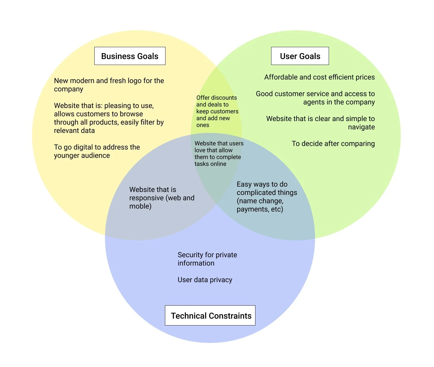
Project Goals
To decide what to prioritize, a diagram was created to list out business and user goals as well as technical constraints.
Product Features Roadmap
Based on 1:1 interviews, competitor analysis, and secondary research, I categorized features into: Must-haves, Nice to have, Surprising and delightful, and Can come later.

Card Sorting
Did card sorting to determine groupings. The findings are shown below.
Overview:
9 participants in total; Open card sort; 19 cards

Findings:
Average time spent: 3 min 48 sec
Average # of categories created: 3
Participants created 2-5 categories each

Analysis:
Life, Auto, and Home Insurance were grouped up 100% of the time, with Insurance Bundles being included in that group 88% of the time.
File a Claim and FAQ had the most differences in grouping
Design
After researching and defining what the product would be, the work began of envisioning the final product. This phase was focused on bringing together the research and the features.
Site Map
Building from the product features roadmap and goals, the site map was created to visualize what each section would contain and lead to.

Task and User Flows
As I started to think through the process of building the product, I chose the main task for the user to be: Get Quote based upon research.

Sketching
After all the work and research, it was time to start sketching! I got my ideas from competitors like State Farm, Geico, and All state, took to dribbble, pinterest, and other sites to make the possibilities.

Wireframes
After sketching out various options, I decided to go with the 3rd sketch with some elements I liked from other sketches and it was time to start building out the wireframes to make the product into a reality.

UI
With the skeleton, it was time to start filling in for this process. I got some of the creative juices flowing and the product was brought more to life.
Logos:

After iterations and feedback, I went with a different color palette and the logo was tweaked to fit the feel of the company a little more. The final results are shown in the style tile below!
Style Tile:

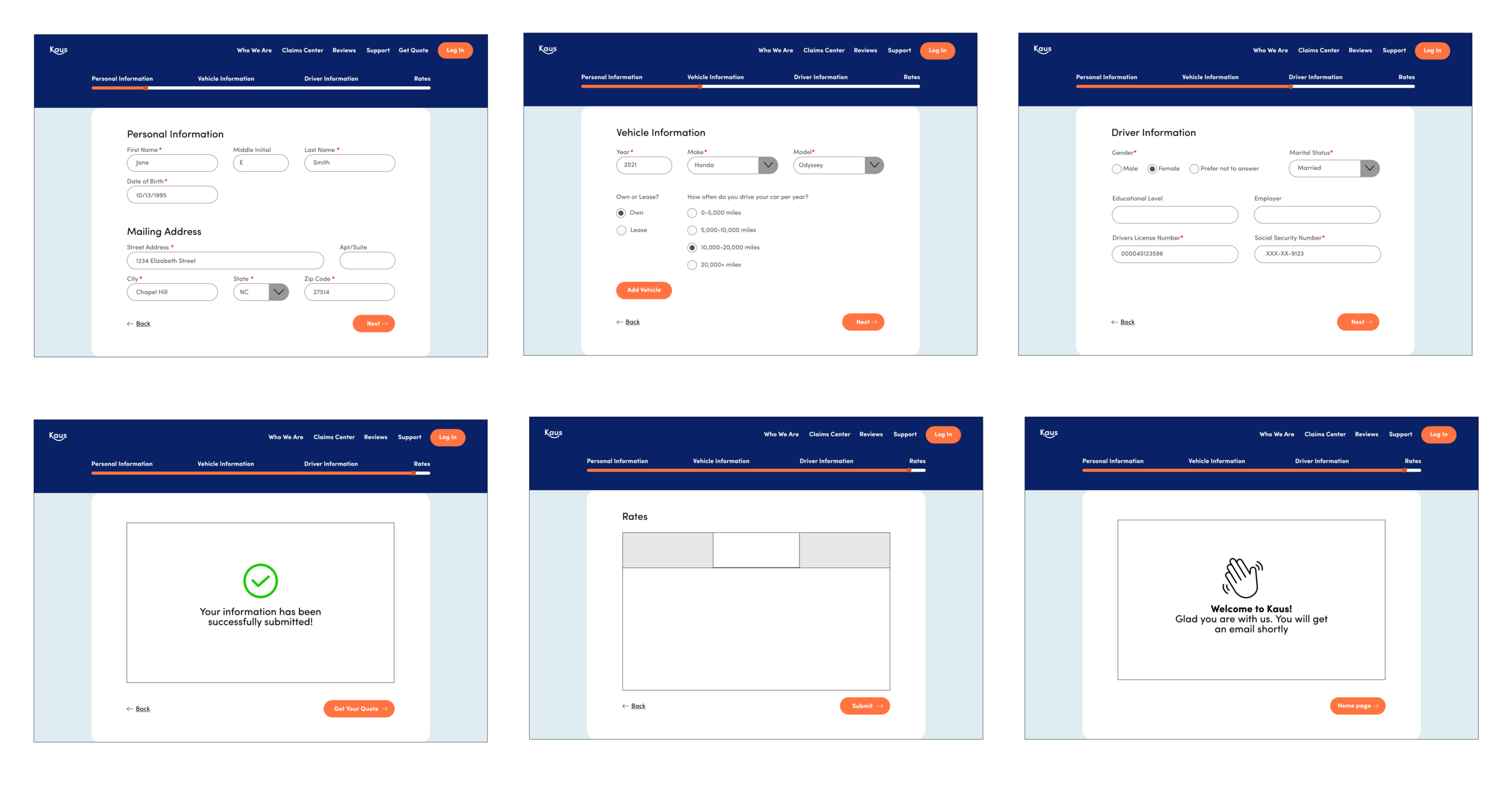
Responsive Site
Finally, the first draft of the site is created! With a lot of research, defining, designing, and commitment to the product and the user, here it is:

Testing
Prototype
I made a prototype with Figma in order to have a mock up of how the product will be. Having the prototype allowed me to test 5 users and make adjustments accordingly.
Take a look HERE to check out the prototype!

Affinity Map
After creating the prototype, I had 5 participants test the site and provide feedback. I distilled it to post-it notes and created an affinity map, naturally leading to changes that should be made to the product.

Iteration
After receiving feedback from the participants, I made some changes to have a fuller prototype. Check out the new prototype HERE
Added history and background to the “Who We Are” section

Included few more questionnaire pages that users could interact with for a fuller testing experience
Next Steps
Build out more pages and sections if time and budget allows for it
Continue to iterate, test, and update
Prepare the product to handoff to the next team: developers