

Spotify Dashboard
As a project, I added a feature to Spotify based on user needs

Overview
Role: Product Designer
Business: Spotify
Duration: 2 weeks
Tools: Figma, Canva, Whimsical, Miro
The Background
Spotify was founded in 2006 and launched in 2008 giving people the option to have a free account with ads or to pay a monthly subscription for ad-free music. It is the world’s largest music streaming provider with over 381 million active users including 172 million paying subscribers. It has grown and made many changes through the years to cater to the user. In order retain the users they already have and potentially gain more, I will be proposing to add a feature.
The Goal
To understand how people use Spotify on a daily basis and if there are any frustration points or needs for improvement of the experience
The Challenge
To design a mobile feature that Spotify users need
Research- What Users Want vs What I Think Users Want
Research Objectives- The Key to Actually Understanding the User
Determine what users do most when they listen to Spotify
Determine what causes users to listen to music
Determine if there are any frustration points with the app
Competitive Analysis
There are a whole host of music streaming services but I chose the top 4 to analyze with Spotify based on research online. I looked closely at the features of each competitor to note differences.

Feature Analysis

SWOT Analysis

Takeaways:
Weaknesses could present opportunities if companies identify it and create a solutions
Able to gain insight with people who don’t use specific service by learning why they do not use it
What makes a company stand out is by highlighting what works well in the product
Interviews- Hearing From Real Users What They Want
I interviewed 5 people who used music streaming services extensively. They provided a picture of day to day use and insight on likes & dislikes about Spotify and Apple Music.
5 participants ranging from ages 18-29 and all used Spotify OR a music streaming service
Key Findings from Interviews:
All participants listen to music for daily things such as walking, working out, chores.
2 out of 5 participants listen to Daily Mixes, playlists made by Spotify based on what people listen to.
There was 1 Apple Music user and it was helpful to hear her take to see what Apple Music and what she likes and does not like about Apple Music.
All use their homepage minimally (podcasts and daily mix).
Needs for Users: A way to personalize their daily mixes and a way to personalize a section or space that only includes what user actually uses on Spotify
The Problem: Spotify has a lot to offer- Discover, Top Genres, Daily Mixes, Recommended, etc, which can overwhelm the user
The Solution: A feature that allows users to customize a space
Affinity Map for Interviews- Figure Out How Might We Solve Their Problems
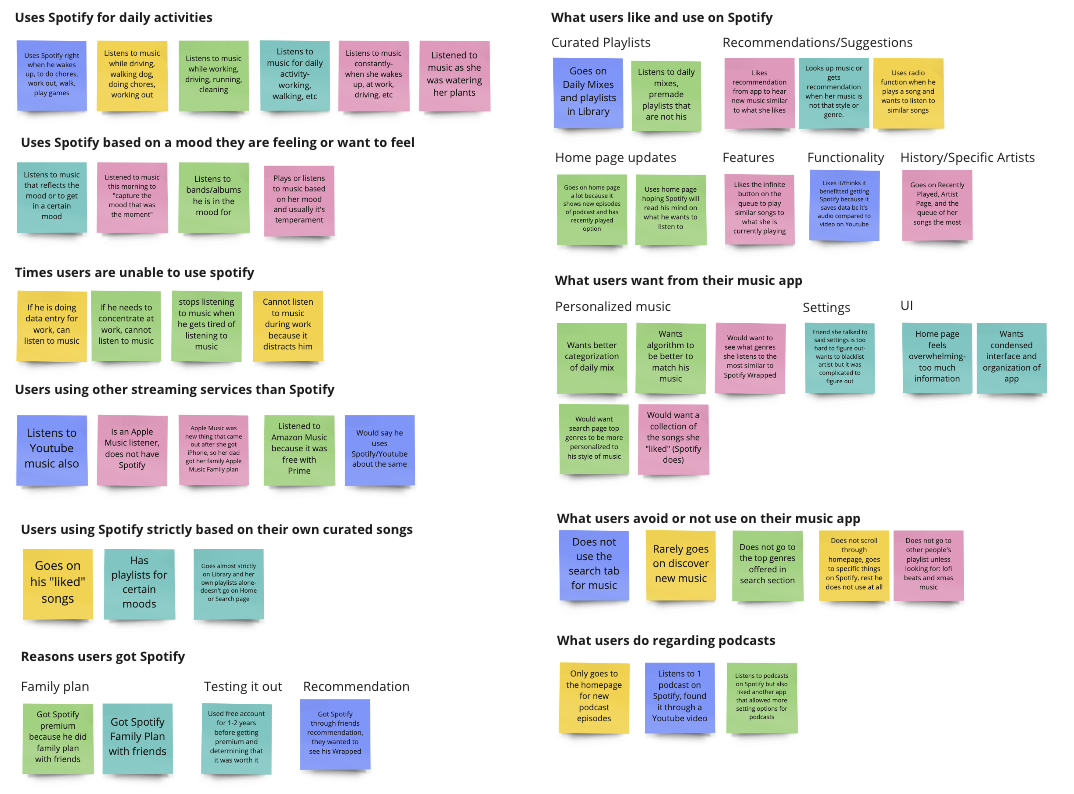
Pain Points:
Users want a more personalized experience and options from their app
Users find the home page overwhelming. They do not need everything offered
HMW Statements:
How might we allow more customization and personalization based on what Spotify already offers?
How might we condense and simplify what is shown on the app?
Define- With a Clear Problem, Time to Find a Solution
With clarity about the needs of the user through competitive analysis and the interviews, this phase was to build out a new feature on Spotify: Spotify Dashboard.
Empathy Map- Who is my User?
From the interviews, I created an empathy map highlighting what the user is feeling, thinking, saying, hearing, and doing. It allowed me to get in the mindset of a user of Spotify. As an avid Spotify user, my main goal was to see if I could help people like myself have a better experience while using the app.

Persona- Our User Needs Customization
From the interviews, empathy map, and research Jorren was created in order figure out what the added feature on Spotify needed to look like.

Card Sorting- Placing All Content in the Correct Spots

Design- Building Upon What Already Exists
The focus was not so much on the style, since branding for Spotify already exists, but to build out a clear, easy-to-use infrastructure to the new feature, Spotify Dashboard.
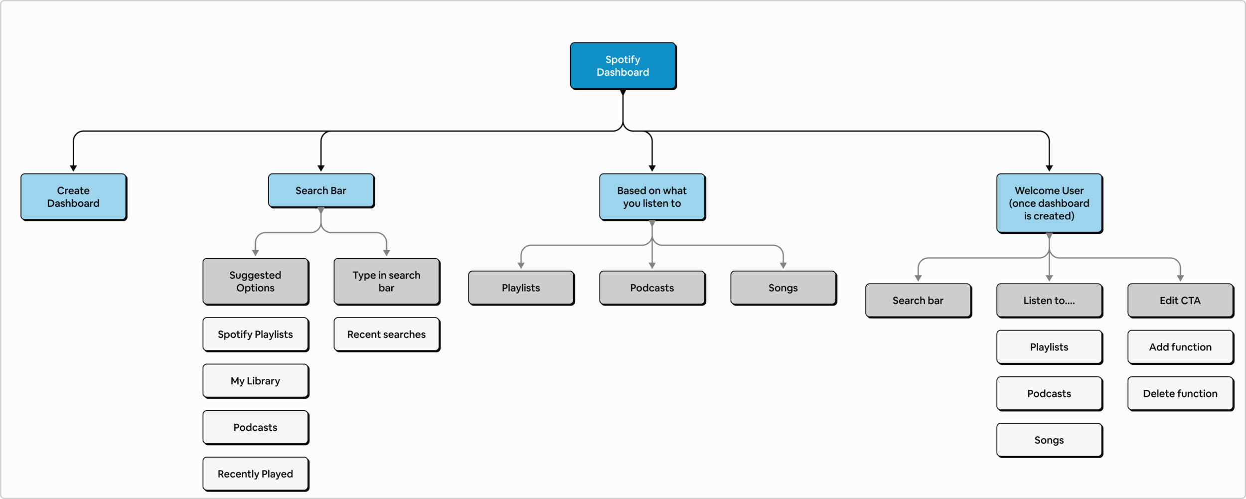
Site Map- Does it Fit With the Rest of Spotify
Because this was a whole new feature to Spotify, I had to make sure it was organized well. Breaking it down to categories and groups with the sitemap helped me visualize how it would be structured.
User Flows- Creating the Dashboard
With the persona, Jorren in mind, I thought about how to he would use the dashboard on Spotify, so the user flow was created.

Sketching- Ideating the Feature to Life
I created a sketch flow on how we would build the “Spotify Dashboard”.

Wireframes- The Skeleton of the feature
To start the process of building out the feature, I created wireframes and followed Spotify’s design/branding closely.

UI- Designing with Intentionality for Users
The purpose of this case study is to help users enjoy their experience with Spotify. One thing people mentioned multiple times was that Spotify felt overwhelming. Keeping that in mind, I tried to design in a way that’s readable, simple, and not overwhelming.
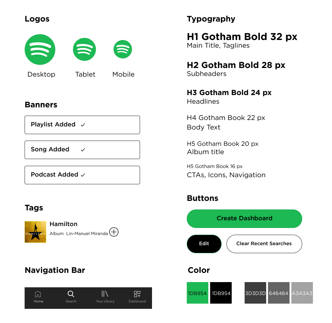
Style Tile:
Responsive Site- Bringing the Customization into Action
With the style tile and wireframes, the first version of the site was created. I kept it close to the app as much as possible and here are the mock ups!


Testing- Is This What Users Want?
Prototype- Testing Out the Dashboard
I made a prototype with Figma to test added feature on Spotify: Spotify Dashboard. I focused mostly on the creation of the Dashboard that users would experience.
Take a look HERE to check out the prototype!

Affinity Map- Hearing From the User
After creating the prototype, I had 4 participants test the site and provide feedback. I chose the tasks to test out how it was adding from suggested playlists from Spotify as well as the search function. After the testing, I was given a lot of helpful suggestions.

Iteration
I created another prototype after the feedback. It became more robust and since these were things that the users suggested, I knew I was going in the right direction.

Main changes and additions I made to the prototype were the following:
Added “How to Section” at the Create Screen
Added option to add to Dashboard from any page (home, library, search)
Changed the Dashboard Home Page to be editable rather than only adding

Final Screens- v.2 of Spotify Dashboard


Next Steps
Build out the instructions on the “Create Dashboard” page more
Conceptualize and build out the Edit page
Learnings
It’s important to know what the users actually want. My research brief was entirely recreated because I at first, I wanted to have a feature where users could use Spotify more as a social app. However, it was just an assumption I made about what I thought the users needed. So, starting over again, I focused on pain points and “How Might We” statements for the interviews which helped me figure out what users actually wanted and needed.
Users need clear instructions and guidance on setting up new things. Because the feature was new on an app they were already familiar with, people seemed a little confused and wanted clarity.